
Ecommerce Web Development Services
Transform your online store with UV Soft Solutions, where we specialize in creating powerful, scalable eCommerce solutions tailored to your business needs. From sleek, user-friendly designs to robust, secure shopping experiences, our team ensures your store stands out and performs seamlessly across all devices. We handle everything from platform integration and custom functionalities to payment gateways and inventory management, helping you drive sales and grow your business in the competitive eCommerce landscape.
4.6
3K
Design Staff
12k
Project Completed
Request a Free Quote
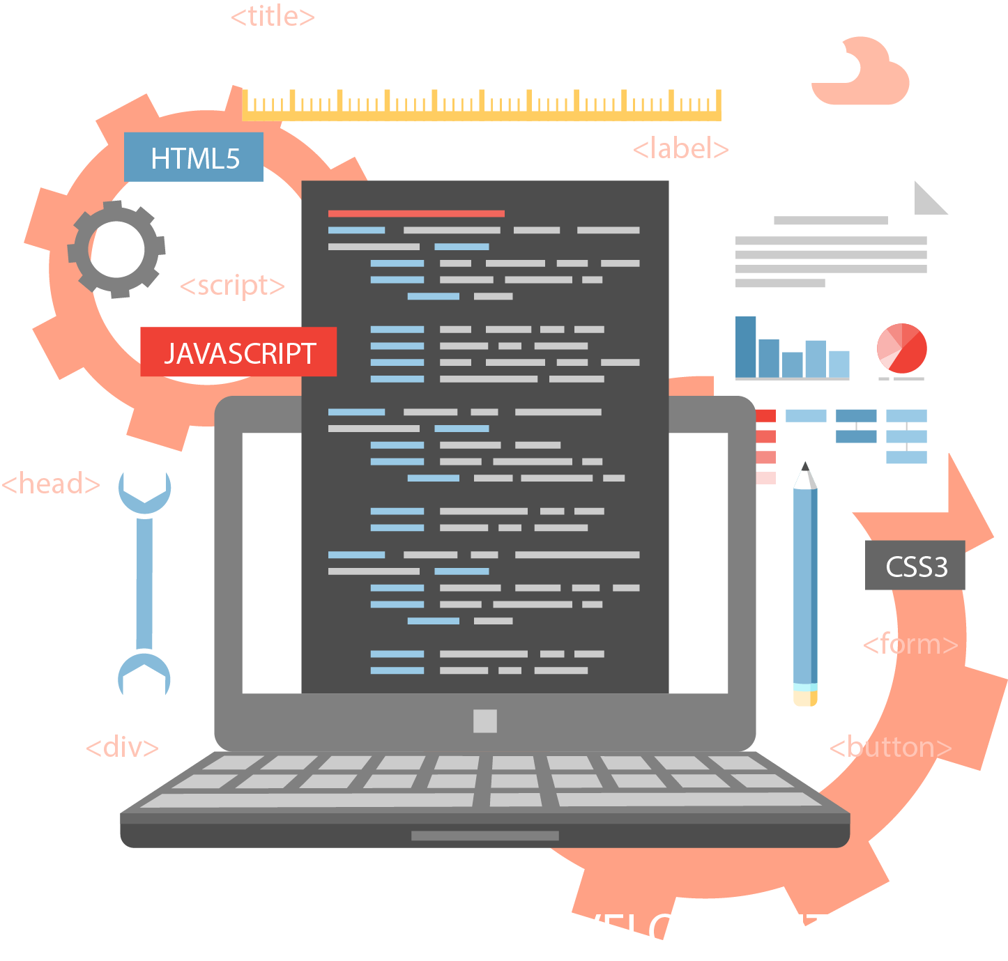
Create, Innovate, and Succeed with Our Web Development Services
In today's digital world, having a strong online presence is important for businesses, especially those who are in the eCommerce sector.
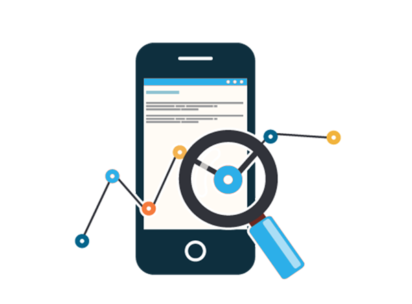
With the increasing use of smartphones and tablets, optimize your eCommerce website development for mobile users has become importantly.
In this blog post we will talk about why it's important to make your eCommerce site mobile-friendly and some key ways to improve your shopping experience.
Why Mobile Optimization Matters
The growing popularity of smartphones has changed the way people shop online. People may now quickly explore products and make purchases while they're on the move. If your eCommerce website isn't responsive on mobile devices, you could lose a lot of potential clients. These are some reasons why mobile optimization performance is important:
- Wider Reach: A broader audience can view your website because of mobile optimization. This is especially important because of the growing number of people who use the internet mostly through mobile devices.
- Improved User Experience: A mobile optimized website ensures that users can go through your website. It provides a seamless experience, reducing bounce rates and increasing the chances of conversion.
- Higher Search Engine Rankings: Search engines like Google prioritize mobile friendly websites in their search engine result pages (SERP). Mobile optimization can boost your websites in the search engine result pages, leading to increase organic traffic to your website or business.
- Competitive Advantage: In the competitive eCommerce world, having a mobile friendly website can give your business an advantage over competitors who have not yet optimized for mobile users.
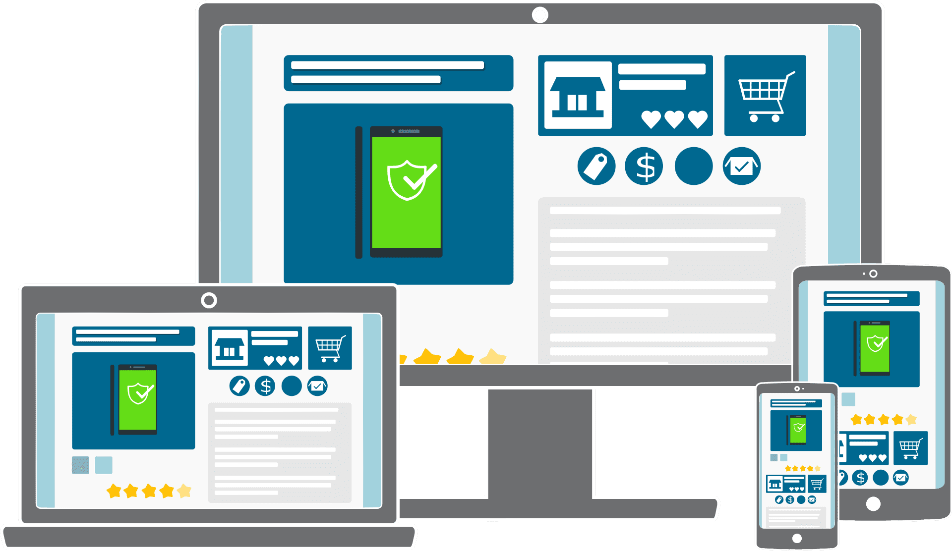
Key Strategies for Optimizing Your eCommerce Website for Mobile Users
Now that we've established the importance of mobile optimization, let's dive into some key strategies to ensure your eCommerce website is fully prepared for mobile users:
- Responsive Design: Use a responsive website design so that it adapts to different screen sizes on its own. This ensures that your eCommerce website will display & work properly on tablets and the smartphones. For the same user interface on all devices, a responsive design is required.
- Fast Loading Speed: Mobile users are often on the go and have limited patience for slow-loading websites. Optimize your site's performance by compressing images, reducing unnecessary scripts, and leveraging browser caching to enhance page loading speed.
- Mobile Friendly Navigation: Simplify your website's navigation for mobile users. Use clear and intuitive menus and buttons, and ensure that the most important content is easily accessible without excessive scrolling or zooming.
- Mobile Payment Options: Make the checkout process as seamless as possible for mobile users. Implement mobile payment options such as digital wallets and one-click purchasing to streamline the buying process.
- Optimize Images and Media: Compress and optimize images and media files for mobile viewing. Large image files can slow down a page's loading time, so it's crucial to balance between quality and loading speed.
Take Advantage of Affordable Small Business Website Development Packages in India
Take your business to new heights by creating a website. UV Soft Solutions offers budget-friendly website development packages tailored for small businesses, equipped with impressive features that set your website apart from your competitors in the industry.
We understand the significance of a website for any business, and thus we offer cost-effective website development pricing packages that cater to businesses of all sizes, be it small, large, or startup enterprises.